When you open a record for editing from a table, or create a new record, the interface presents the editable data across one or more tabs. These tabs help organize information by category or function. Within each tab, fields may be further grouped in labeled boxes for clarity.
Field types
Depending on the type of value to be entered, it is shown in a specific field:
| Type | Example | Description |
| Numeric fields |  | Accept only numbers, often used for quantities. The unit is shown at the right side. |
| Alphanumeric fields |  | Allow both text and numbers; used for names, codes or descriptions. |
| Dropdown selection fields |  | Display a dropdown list with predefined options that can be selected. |
| Linked module selection fields |  | Opens the table view of another module as an overlay, where you can select one or more items and confirm your selection. In some cases, it is also possible to create new items directly within the overlay before selecting them. |
| Date picker |  | Opens a calendar to easily select a date. Click the month/year to select subsequently a year and month. Use the arrows to select the same date in the previous or next month. Click Today to set the field to the current date. |
| Time picker | 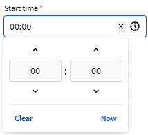 | Open a selector to choose a specific time. Use the arrows or enter a value to adjust hours and minutes. Click Now to set the field to the current time. |
| Color picker |  | Lets you choose a color visually, or by entering a color value. RGB decimal, HSL and RGB hex are supported. Use the color picker  to select a color anywhere on your screens. The button shows the selected color. to select a color anywhere on your screens. The button shows the selected color. |
| Switches |  | Toggle fields that turn options on or off (e.g. active/inactive). |
| Radio buttons | 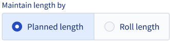 | Allow users to select one option from a limited set of predefined choices. |
Required fields
Fields marked with a red asterisk (*) are mandatory. If a required field is located in another tab, that tab's name will turn red when you attempt to save without completing the field, indicating where input is still needed.
Name field
The Name field usually shows a name Suggestion with an Apply button next to it. The Name generation pattern can be defined via the settings ( ). See Name generation pattern for more information.
